Utilizing Analogous Colors in Interior Design
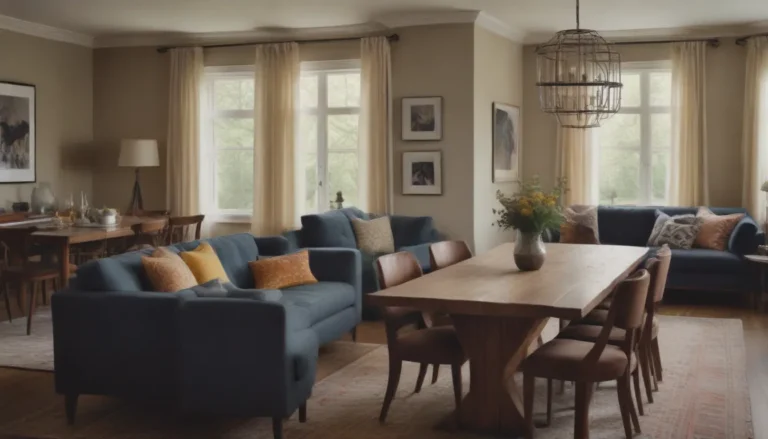
In the world of interior design, the use of colors plays a crucial role in setting the mood and atmosphere of a space. One particular color scheme that designers often turn to is analogous colors. Analogous colors are colors that are next to each other on the color wheel and share a harmonious relationship, making them a popular choice for creating a cohesive and visually appealing look in a room.
Understanding the Color Wheel
Before diving into the world of analogous colors, it’s essential to have a basic understanding of the color wheel. The color wheel is a visual representation of the spectrum of colors, showcasing the relationships between primary, secondary, and tertiary colors. It serves as a foundational tool in color theory, helping designers mix and match colors effectively.
Analogous colors are easily identified on the color wheel by selecting a starting color and then choosing the colors adjacent to it. These colors form a group of analogous colors that work well together due to their close relationship. This color scheme is commonly found in nature, such as in the changing hues of autumn leaves or the colors of a sunset.
Creating an Analogous Color Palette
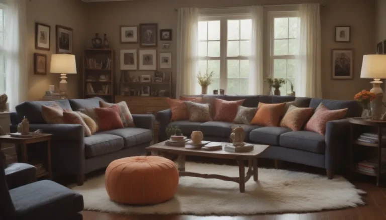
When incorporating analogous colors into your home decor, it’s crucial to select a main color to anchor the room’s design. Start by choosing a primary color from your group of analogous colors and use the secondary and tertiary colors as accents. This main color will serve as the focal point, while the other shades can be used to add depth and interest to the space.
To achieve a balanced look, many interior designers follow a ratio of 60% main color, 30% closely related color, and 10% non-related color. This distribution helps create a harmonious color scheme that is visually appealing and well-coordinated.
Tips for Using Analogous Colors:
- Choose a main color from your analogous group to focus on.
- Use secondary and tertiary colors as accents.
- Follow a 60:30:10 ratio for a well-balanced look.
- Create contrast to prevent colors from blending together.
Adding Contrast in Analogous Color Schemes
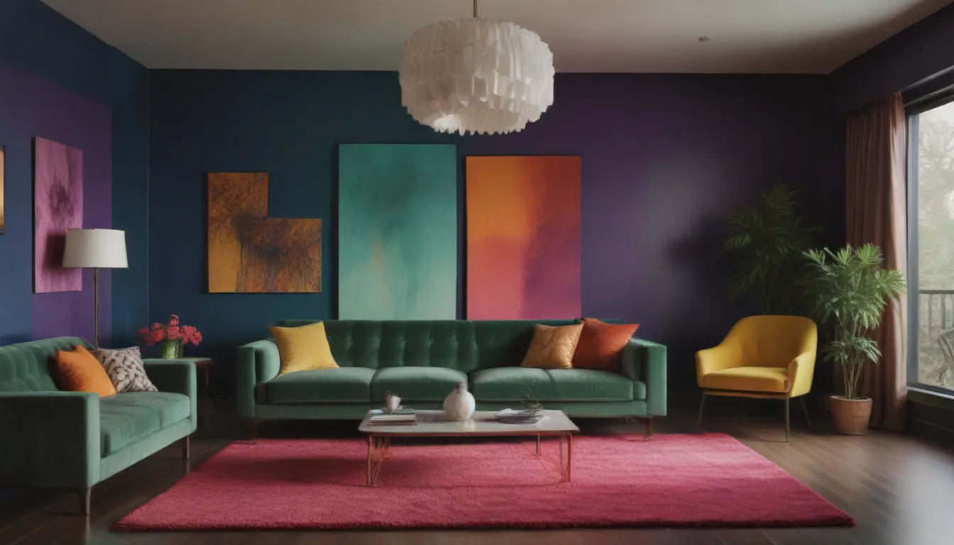
While analogous colors create a harmonious and soothing atmosphere, it’s essential to introduce contrast to prevent the colors from blending into each other. By selecting a focal color and incorporating patterns and textures, you can create visual interest and depth in the space.
Balancing color levels through the use of small, medium, and large color choices is key to achieving a well-rounded look. By combining different shades and tones within your color palette, you can ensure that your space feels cohesive and inviting.
Exploring Different Analogous Color Sets
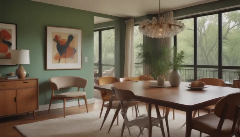
Once you’ve chosen an analogous color family for your room, it’s time to explore different color sets and palettes that work well together. Whether you prefer cool neutrals, earthy tones, or soothing hues, there are endless possibilities for creating a beautiful and cohesive color scheme in your home.
Cool neutrals:
– Shades of gray, blue, and green
– Creates a calming and elegant atmosphere
Earthy tones:
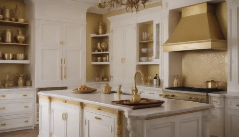
– Warm browns, greens, and yellows
– Adds a cozy and natural feel to the space
Soothing hues:
– Soft pastels and muted tones
– Evokes a sense of tranquility and relaxation
Additional Tips for Choosing Colors
Before finalizing your color scheme, consider the following tips to ensure a successful outcome:
- Consider the natural light in the room and how it will affect the colors.
- Test paint samples on the walls to see how they look in different lighting conditions.
- Don’t be afraid to experiment with different color combinations until you find the perfect one for your space.
By incorporating analogous colors into your home decor, you can create a cohesive and visually pleasing environment that reflects your personal style and taste. Experiment with different color combinations, textures, and patterns to find a look that resonates with you and transforms your space into a welcoming and harmonious sanctuary.
