The Ultimate Guide to Midcentury Modern Paint Colors: Creating a Vintage Vibe in Your Home
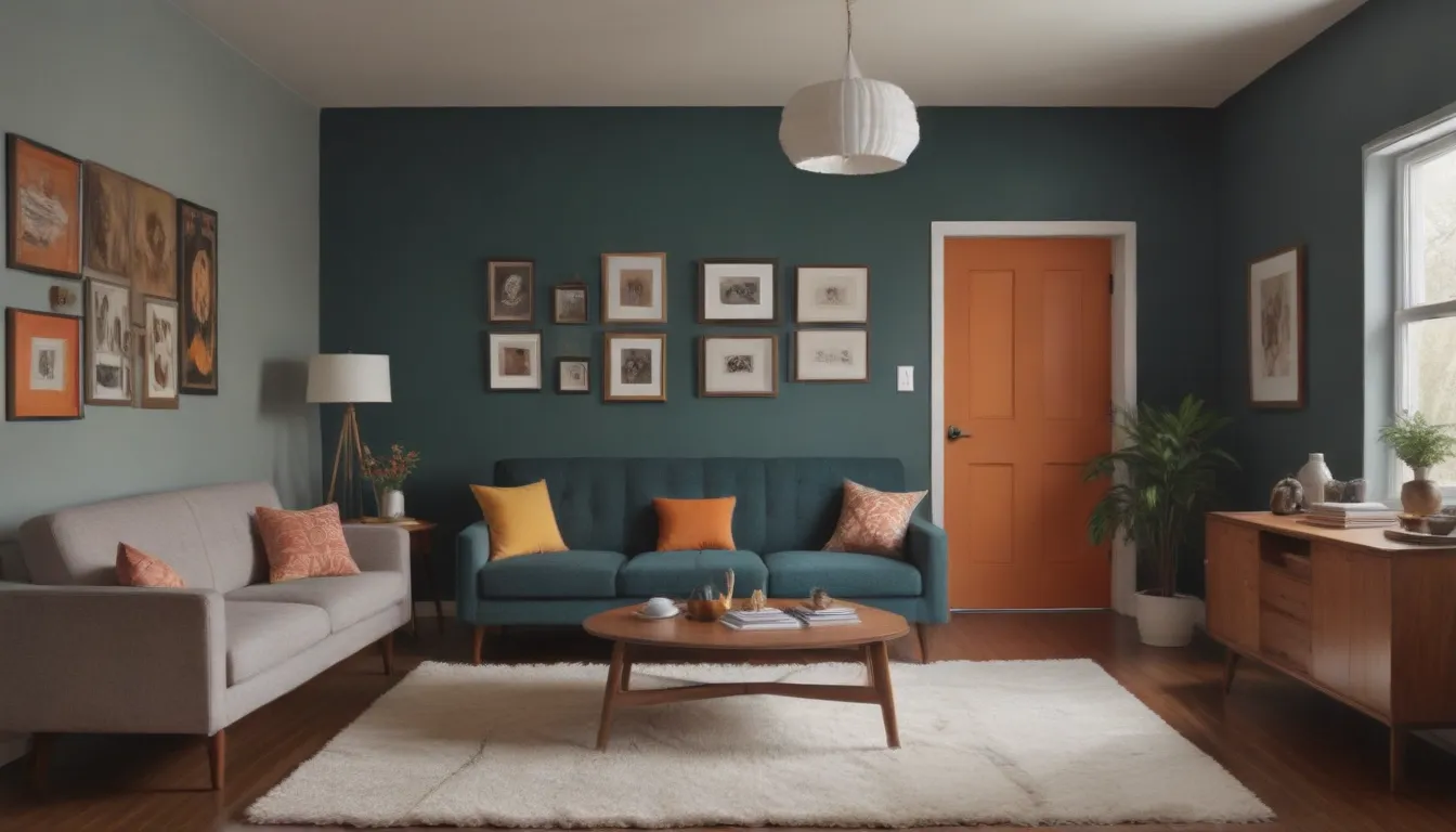
Are you a fan of the retro-inspired midcentury modern look? From trendy hairpin-legged tables to vintage light fixtures, there are countless ways to incorporate this timeless style into your home. But to truly embrace the midcentury modern aesthetic, you need to pay attention to every detail – including your paint colors.
Midcentury modern paint colors are known for their vibrant and bold hues, often with hints of earth tones and neutrals. These colors evoke the spirit of the 1950s and ’60s design era while still being perfectly suited for contemporary decor. By choosing the right paint colors, you can transform any space into a fun, lively, welcoming, and comfortable environment that exudes vintage charm.
What Makes Midcentury Modern Paint Colors Stand Out?
- Color Family: Midcentury modern paint colors typically belong to the warm color family, including shades of greens, yellows, oranges, reds, pinks, and blues.
- Complementary Colors: These bold hues are often complemented by neutral tones like whites, blacks, and grays for balance.
- Pairs Well With: Midcentury modern paint colors pair well with natural materials like wood, as well as retro-inspired furniture and decor pieces.
- Mood: These colors create a nostalgic and vibrant mood, adding depth and character to any space.
- Where to Use: These paint colors work well in various rooms, from bedrooms and living spaces to kitchens and entryways.
Now, let’s explore some of the best midcentury modern paint colors that can bring a vintage vibe to your home while still looking fresh and stylish.
Magnolia Home Eden
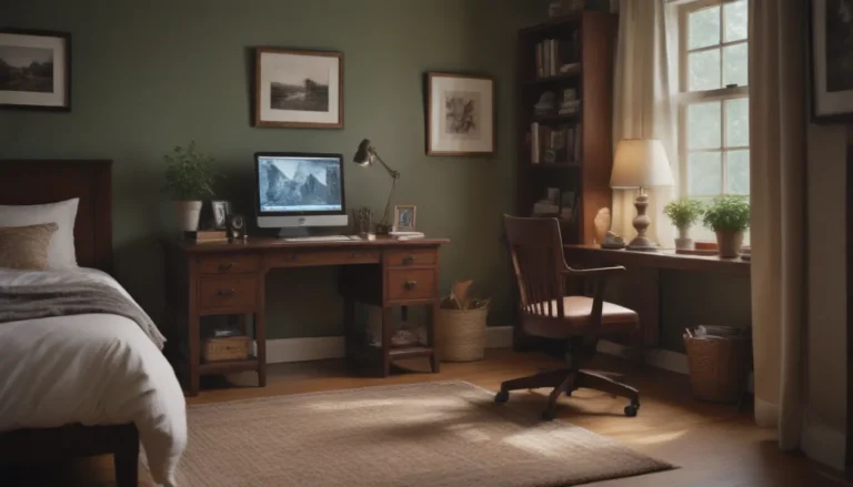
Embrace the ’50s and ’60s design era with Magnolia Home’s Eden, a cool ivy green that adds a touch of retro charm to any room. This earthy green shade is perfect for bedrooms or living spaces and pairs beautifully with bolder colors. For a striking look, use it with white trim to highlight the architectural details of the space.
Tip: When painting walls with contrasting trim colors, use painter’s tape for clean lines. However, with a steady hand and a quality angled brush, you can achieve a clean paint line without tape. Avoid overloading your brush with paint to prevent dripping.
Behr Yellow Gold 360D-6
For those who aren’t afraid to make bold design choices, Behr’s Yellow Gold is the perfect representation of the midcentury modern love for warm and golden hues. This cheerful yellow tone pairs well with other warm colors like tan and burnt orange, making it an ideal choice for kitchens or entryways where a pop of color is needed.
Sherwin-Williams Relentless Olive SW 6425
Add a touch of earthy elegance to your space with Sherwin-Williams’ Relentless Olive. This green hue works wonders as an accent wall or as the main color for a room, acting as a focal point that sets the tone for the decor. Pair it with other muted midcentury colors like mustard yellow and burnt orange for a cohesive look.
Sherwin-Williams Heartthrob SW 6866
Inject some bold red into your decor with Sherwin-Williams’ Heartthrob, a vibrant fire engine red that demands attention. While red may not be for everyone, this bold shade is perfect for making a statement in areas like kitchen cabinets, powder rooms, or accent walls.
Tip: To achieve solid coverage with bold red paint, use a gray-tinted primer before painting. This will reduce the number of coats needed for full coverage.
Farrow & Ball Nancy’s Blushes No. 278
Soft pinks like Farrow & Ball’s Nancy’s Blushes add a subtle pop of color to any space while maintaining a neutral feel. When paired with crisp white trim and doors, this pink shade appears more vibrant and daring. Whether used in bedrooms, bathrooms, or living spaces, this pink shade complements a variety of decor styles.
Sherwin-Williams Carnival SW 6892
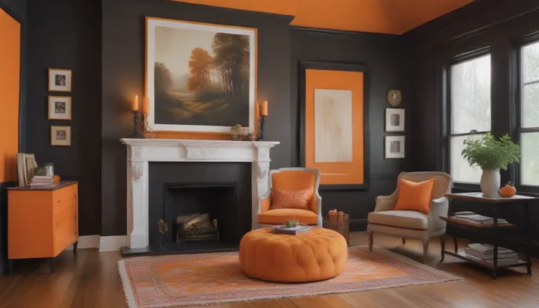
No midcentury modern palette is complete without a bold, harvest-inspired hue like Sherwin-Williams’ Carnival. This vibrant orange adds a burst of energy to any room, making it an ideal choice for accent walls or focal points in your home. Pair it with wood tones for a warm and inviting feel.
Sherwin-Williams Pure White SW 7005
If you prefer a more understated look, Sherwin-Williams’ Pure White is the perfect backdrop for your midcentury modern decor. This classic white shade serves as a neutral canvas that complements bold colors and vintage accents. Let your furniture and accessories shine against a crisp white backdrop.
Magnolia Home Morning Calm
Aqua shades like Magnolia Home’s Morning Calm are a staple in midcentury modern design. This light and bright aqua blue adds a serene touch to bedrooms and living spaces when paired with white accents and wood tones. For a truly retro vibe, combine this aqua shade with burnt oranges, golds, and browns for a cohesive look.
In conclusion, when it comes to transforming your space with midcentury modern paint colors, don’t be afraid to go bold and experiment with vibrant hues that reflect the spirit of the ’50s and ’60s. Whether you opt for earthy greens, warm yellows, or bold reds, these colors can infuse your home with a vintage vibe that feels fresh and stylish. So go ahead, paint your walls with these iconic hues and create a space that exudes midcentury modern charm.
