Transforming Your Kitchen: The Power of Painted Cabinets
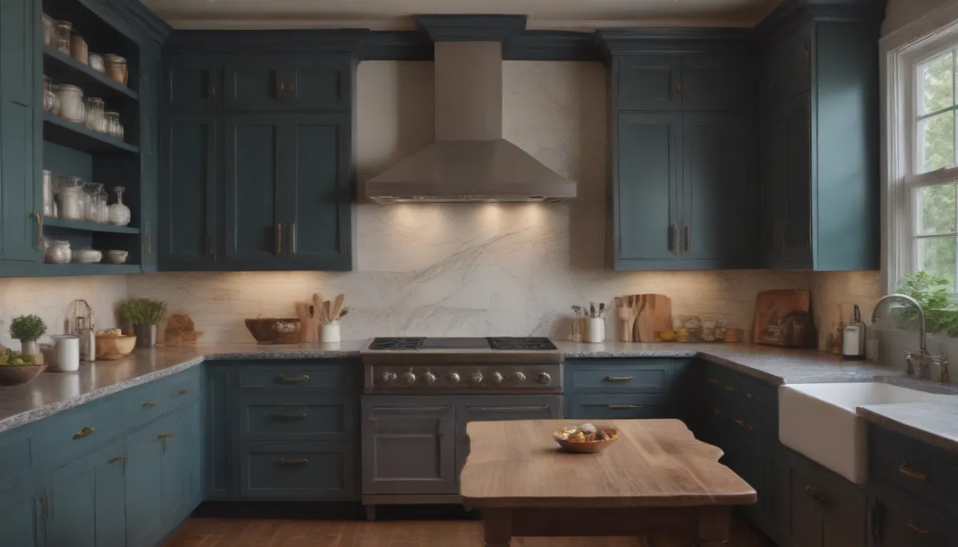
When it comes to updating your kitchen, one of the most impactful changes you can make is to your cabinetry. The cabinets in your kitchen play a significant role in setting the overall tone and style of the space. If a full kitchen remodel isn’t in the budget, don’t worry! You can still give your kitchen a fresh new look by simply painting your cabinets.
In this article, we will explore the magic of painted kitchen cabinets through a collection of before and after pictures that showcase the incredible transformation a change of color can bring. Get ready to be inspired by these stunning kitchen makeovers that prove the power of paint in creating a beautiful and functional space.
Before: Basic Basement Wet Bar
Stephanie Watkins from Casa Watkins Living loved bold, modern colors but felt that her basement wet bar was lacking in personality. By painting the cabinets a rich yellow color, she was able to add a fresh pop of color that brightened up the space and complemented the teal tile backsplash perfectly.
After: Modern and Bold
Stephanie’s decision to go bold with the cabinet color transformed her basement into a vibrant and inviting space. The rich yellow hue added a touch of warmth and personality to the area, making it a focal point of the room.
Before: Plenty of Potential
This kitchen featured midcentury modern shaped cabinetry with a functional layout, but it lacked color and personality. By adding a coat of mint green paint to the upper cabinets and pairing them with a bubblegum pink tile backsplash, Sarah was able to create a playful and retro feel in her kitchen.
After: A Retro Feel
The new color palette injected life and energy into the kitchen, giving it a fresh and modern look. The combination of mint green and pink created a harmonious and stylish balance that elevated the overall aesthetic of the space.
Before: A Cluttered Look
Stephanie from Casa Watkins Living faced a challenge with dark cabinetry and countertops that made her kitchen feel cramped and cluttered. To transform the space into something brighter and more open, she decided to go for an all-white kitchen with a twist by incorporating stained wood cabinets for contrast.
After: Contrasting Cabinets
Stephanie’s decision to mix white cabinets with stained wood ones added depth and visual interest to the kitchen. The contrast between the two colors created a dynamic and stylish look that made the space feel more open and inviting.
Before: Outdated Design
Jackie from Finding Lovely tackled an outdated kitchen with solid wood cabinets and state-of-the-art appliances that were in need of a refresh. By painting the cabinetry in a crisp white hue and adding a contrasting color to the island, she was able to give the space a refreshing update.
After: A Refreshing Update
Jackie’s choice of colors and design elements transformed the kitchen into a bright and welcoming space. The white cabinetry provided a clean and timeless backdrop, while the island in a contrasting color added a pop of personality and style.
Before: Dysfunctional Kitchen
Hannah and Tyler faced an outdated and dysfunctional kitchen with U-shaped cabinets that didn’t offer a nice flow for a functional space. By tearing down walls, extending the cabinet and countertop space, and choosing a matte black finish for the cabinets, they created a more functional and visually appealing kitchen.
After: Black and White Beauty
The redesign of the kitchen brought in more natural light and created a spacious and functional layout. The matte black cabinets added a touch of sophistication and elegance to the space, making it feel more cohesive and inviting.
Before: Dark Everything
Jenn’s kitchen featured dark cabinetry, flooring, and countertops that made the space feel dark and confined. By painting the cabinets white and adding natural wood accents, she was able to transform the kitchen into a bright and open farmhouse-style space.
After: A Farmhouse Makeover
Jenn’s use of white cabinetry and natural wood accents brought a sense of lightness and warmth to the kitchen. The combination of white and wood created a cozy and inviting atmosphere that was both modern and rustic.
Before: A Traditional Kitchen
Rebecca Rollins took on a traditional kitchen with dark wood cabinetry that needed a contemporary refresh. By opting for lighter cabinetry that extended to the ceiling and adding a wrapped range hood, she was able to give the space a more modern and cohesive look.
After: A Contemporary Refresh
Rebecca’s choice of colors and design elements transformed the kitchen into a bright and stylish space. The lighter cabinetry and sleek range hood added a touch of elegance and sophistication to the room, making it feel more open and inviting.
Before: Vintage Pegboard Cabinets
This ’50s kitchen designed by William Krisel featured midcentury modern design with vintage pegboard cabinets and a tile countertop. By updating the color palette with orange hues and maintaining the original design elements, the kitchen was able to retain its retro charm while still feeling contemporary.
After: Midcentury Modern Orange Hues
The colorful update added a vibrant and retro vibe to the kitchen, giving it a fresh and playful look. The combination of orange hues and vintage elements created a unique and stylish space that honored the history of the original design.
Before: 90s Maple Wood Kitchen
Martina’s kitchen was outdated with maple wood cabinetry that needed a refresh. By refinishing some of the cabinetry in an eggshell color and adding butcher block countertops for contrast, she was able to create a soothing and contemporary color palette.
After: A Soothing Color Palette
The soft color palette brought a sense of calm and tranquility to the kitchen, making it a relaxing and inviting space. The combination of light wood and butcher block created a warm and natural ambiance that was both elegant and cozy.
Before: 60s Pink
Hannah and Tyler faced a kitchen straight from the 60s with pink accent cabinets and outdated appliances. By opening up a wall to let in more natural light and going darker with the cabinet color, they were able to create a sleek and stylish look.
After: A Sleek Look
The decision to go darker with the cabinets added a touch of drama and sophistication to the kitchen. The contrast of light and dark created a dynamic and modern space that felt both inviting and chic.
Before: Outdated Cabinets
Ursula Carmona discovered a family of mice living in her outdated cabinets, prompting her to update the space. By choosing two-toned cabinetry with white upper cabinets and navy lower cabinets, she was able to add interest and elegance to the room.
After: Two-Toned Cabinets
The two-toned cabinets created a visually striking and balanced look in the kitchen. The combination of white and navy added depth and dimension to the space, making it feel more modern and sophisticated.
Before: No Personal Aesthetic
Krystal’s kitchen lacked the warm and welcoming colors that reflected her personal aesthetic. By painting the cabinets white, adding a pink tile island, and incorporating light wood accents, she was able to create a cheerful and inviting space.
After: A Cheerful Kitchen
The bright white cabinetry and pink tile island transformed the kitchen into a sunny and vibrant space. The combination of colors and textures added a playful and whimsical touch that made the room feel cozy and inviting.
Before: Tiny and Dated
This small and dated kitchen needed a fresh new look. By tearing down a wall to create more space, adding open shelving, and opting for bright white cabinets, Hannah and Tyler were able to make the room feel stylish and spacious.
After: Tiny Yet Stylish
The redesign of the kitchen maximized space and light, creating a visually appealing and functional layout. The combination of open shelving and white cabinets made the room feel airy and bright, making it a joy to cook and entertain in.
Before: Dated Pine Wood Cabinetry
Kirsten’s kitchen featured dark pine wood cabinetry that made the space feel dark and uninspiring. By opting for black cabinetry with a vaulted ceiling, she was able to create a dramatic and contemporary look.
After: A Dramatic Finish
The black cabinetry added a touch of sophistication and luxury to the kitchen. The high ceiling and dramatic color choice created a bold and stylish space that felt both modern and elegant.
Before: Dark Green Cabinets
The kitchen felt dark and small with its dark green cabinets. By adding blue and white accents with a retro-style wallpaper, the space was able to feel brighter and more vibrant.
After: Retro Blue and Green Kitchen
The addition of blue and white elements brought a refreshing and lively feel to the kitchen. The retro-style wallpaper added a playful and whimsical touch that made the space feel fun and inviting.
Before: Functional Yet Bland
Although the kitchen had functional elements, it lacked color and personality. By opting for black bottom cabinets, open shelving, and light upper cabinets, Ajai Guyot was able to create a curated and stylish space.
After: A Curated Space
The mix of black, light, and open shelving added depth and visual interest to the kitchen. The contrast of colors and textures created a modern and chic look that felt both sophisticated and welcoming.
Before: A Large Kitchen With No Color
Rebecca Rollins tackled a large kitchen that lacked color and personality. By incorporating bright white cabinetry and a stunning blue island with gold accents, she was able to create a stunning and contemporary space.
After: A Stunning Kitchen Island
The addition of bold colors and gold accents transformed the kitchen into a stylish and elegant space. The combination of white and blue created a fresh and bright look that made the room feel spacious and inviting.
Before: All-White Bar
The all-white kitchen bar area lacked color and style. By adding rainbow shelving, kelly green cabinets, and a pink patterned bar, the space was able to become vibrant and tropical.
After: Rainbow Upgrade
The colorful accents and patterned bar added a playful and tropical feel to the space. The mix of bright colors and bold patterns created a fun and lively atmosphere that made the bar area a focal point in the home.
Painting your kitchen cabinets is a transformative and cost-effective way to update your space and give it a fresh new look. By choosing the right colors and design elements, you can create a kitchen that reflects your personal style and makes a bold statement. Whether you prefer bright and bold hues or soft and soothing tones, the possibilities are endless when it comes to painting your cabinets. So grab a paintbrush and get ready to transform your kitchen into a space that you love!

