Mastering the 60-30-10 Rule in Interior Design
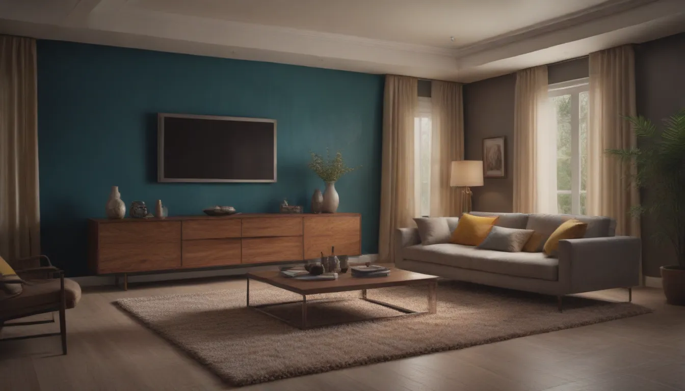
Are you looking to elevate the look of your living space through a harmonious color scheme? Look no further than the 60-30-10 rule in interior decorating. This timeless and straightforward rule can transform your room into a balanced and visually appealing sanctuary. If you’re unsure how to implement this rule effectively or are looking for inspiration on color selection, you’ve come to the right place. Let’s dive into the details of the 60-30-10 rule and how you can use it to enhance every corner of your home.
Understanding the 60-30-10 Rule
The 60-30-10 rule is a foundational concept in interior design that dictates the proportions of colors you should use in a space. By allocating 60% to the main color, 30% to the secondary color, and 10% to the accent color, you can create a cohesive and visually appealing room. Let’s break it down:
- 60%: This is the dominant color that sets the tone for the room.
- 30%: The secondary color complements the main color and adds depth.
- 10%: The accent color injects a pop of personality and visual interest.
Example of the 60-30-10 Rule
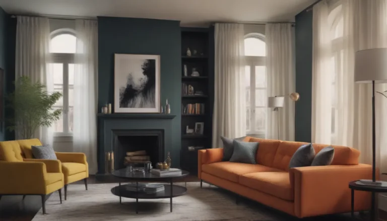
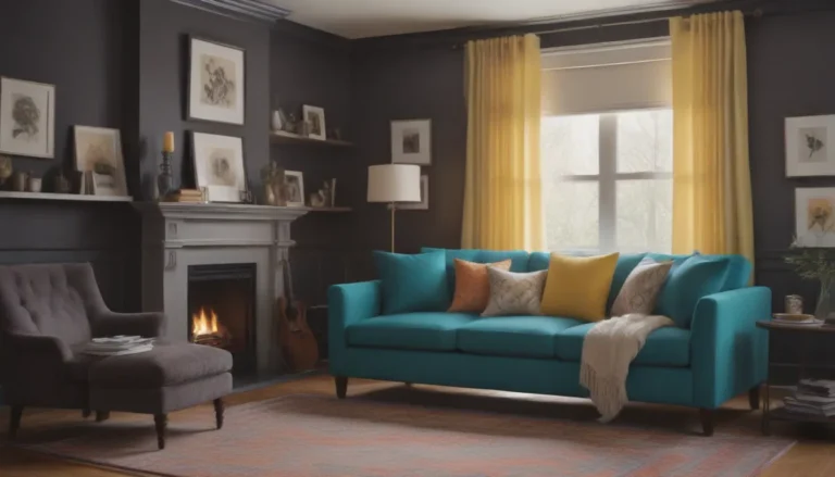
Imagine a room with white walls and furniture (60%), neutral flooring and additional furniture (30%), and pops of a bold accent color through accessories (10%). This simple breakdown showcases how the 60-30-10 rule can transform a space effortlessly.
Implementing the 60-30-10 Rule in Your Design
The key to mastering the 60-30-10 rule lies in selecting the right colors for your space. Here’s how you can choose the perfect trio of colors to bring your room to life:
The 60% Color Rule
The main color acts as the foundation of your design. It should dominate the space and provide a sense of cohesion. Consider the following for your 60% color:
- Walls
- Large furniture pieces
- Area rugs
The 30% Color Rule
The secondary color supports the main color and adds visual interest. Use it on:
- Upholstery
- Drapes
- Accent walls
The 10% Color Rule
The accent color is the cherry on top, bringing vibrancy and personality to the room. Incorporate it through:
- Throw pillows
- Artwork
- Decorative accessories
Choosing Your Color Palette
Selecting the right colors for your space is crucial in achieving a harmonious design. Here are some tips to guide you in the decision-making process:
Utilize the Color Wheel
Start by selecting a main color and exploring various color schemes on the color wheel. Consider options like complementary, monochromatic, or analogous colors to find the perfect palette for your room.
- Analogous: Harmonious colors next to each other on the wheel.
- Complementary: Colors opposite each other on the wheel for a striking contrast.
- Monochromatic: Variations of a single color for a cohesive look.
Draw Inspiration from a Reference Point
Look to existing elements in your space, such as a piece of artwork or a favorite fabric, to inspire your color choices. Let these items guide you in creating a cohesive and personalized color palette for your room.
Stay Updated on Color Trends
Explore current color trends and paint manufacturers’ color of the year selections for fresh and modern color inspiration. Whether you prefer timeless neutrals or bold statements, staying informed on color trends can help you make informed color decisions for your space.
Customizing Your Color Scheme
While the 60-30-10 rule provides a solid foundation for color selection, feel free to experiment and tailor the rule to suit your personal style. Here are some ways to customize your color scheme:
Adding Another 10%
Consider adding an additional 10% to your color scheme for added depth and visual interest. Play with variations of the rule by introducing a fourth color to enhance the overall design of your space.
- Pro Tip: Opt for a small dose of a complementary color to elevate a monochromatic scheme.
Embracing Monochrome
Explore the beauty of a monochromatic color scheme by utilizing varying shades of the same color for your 60-30-10 breakdown. This approach creates a soothing and cohesive look that exudes elegance and sophistication.
- Example: Use a paint color card to guide your monochromatic choices, adding a complementary accent color for a touch of contrast.
When to Break the Rules
While the 60-30-10 rule serves as a valuable guideline, don’t be afraid to break free from tradition and experiment with different color proportions. Trust your instincts and vision for your space, and feel empowered to create a unique color scheme that reflects your personal style.
- Tip: Designers often embrace the 70-20-10 color rule as a variation of the 60-30-10 rule, providing flexibility in color selection while maintaining balance in the room.
In conclusion, the 60-30-10 rule is a powerful tool that can elevate your interior design game and transform your living space into a polished and harmonious environment. By understanding the principles of color proportion and balance, you can create a visually stunning room that reflects your personality and style. So go ahead, unleash your creativity, and master the art of color coordination with confidence!
